Reimagining How Educators Visualize Student Progress.
Discovery Education is an EdTech company that builds standards-based digital products for K–12 classrooms to support teachers and students. Its Science Techbook platform provides multimodal, standards-aligned lessons built on the 5Es learning model to foster literacy and critical thinking.
However, while the Techbook excelled at delivering instructional content, teachers lacked a streamlined way to assess student performance data. This gap made it difficult to tailor lessons or identify struggling students early.
I designed an Assessment Dashboard for the Middle School Science Techbook (Grades 6–8) that helps teachers quickly visualize class and individual performance trends, identify learning gaps, and adjust instruction with confidence, reducing workflow time by 15% and providing continuous visibility into student progress.
PROJECT DETAILSTools: Figma, Dovetail
Website: Visit Live Web App
Role: Product Designer
Platform: Web Application

THE PROBLEMTeachers were unable to clearly monitor student progress across standards, which could impact school district adoption of Science Techbooks.
While Discovery Education’s Techbook provided engaging, standards-aligned content for students, it didn’t offer a way for teachers to interpret assessment data, making it difficult to identify learning gaps, track progress, and connect results back to the lesson content. Since student mastery of standards is a key metric for school districts, tools that fail to help teachers track and improve that mastery can directly influence purchasing decisions. Without clear, actionable assessment insights, districts may view the Techbook as less effective in supporting student success, putting Discovery Education at risk of losing district renewals and new adoptions to competitors offering stronger data-driven reporting tools.
SPEAKING WITH STAKEHOLDERSLearning how usability challenges created business risks in renewals and market positioning.
I met with stakeholders including a sales and customer success manager, I learned that they understood that teacher efficacy directly impacts product value. If teachers couldn’t easily translate assessment data into actionable insights, it weakened the Techbook’s promise of helping every student master key standards, and Discovery Education’s core mission is to improve student outcomes through engaging, standards-aligned instruction.
From a business perspective, this gap created a risk in three key areas:
District Retention and Renewals – School districts expect digital curriculum platforms to show measurable student progress, and without clear data on mastery, administrators may see the Techbook as ineffective and consider switching to competitors with stronger analytics.
Teacher Adoption and Engagement – Even after districts purchase a platform, its success depends on teacher adoption, and if the workflow is inefficient or unhelpful, teachers are less likely to use it consistently, reducing both classroom impact and perceived value.
Strategic Growth and Market Positioning – As edtech competition grows, Discovery Education needed to go beyond delivering great content by enhancing assessment reporting to help educators make evidence-based decisions and strengthen its reputation as a research-backed leader in digital instruction.

TECHBOOK ANALYSISThe Credit Union market is a large ecosystem of different roles, antiqued systems, and siloed team members and processes attempting to uniformly meet the goal of assisting members.
To build a stronger, data-informed understanding of Discovery Education’s Science Techbook instructional structure, I conducted a quick content audit to analyze how concepts and lessons were organized and how teachers used the Techbook to deliver instruction and assessments. I learned that:
Curriculum Standards: Content must align with state and national frameworks.
Educational model: Built on the 5E model and evidence-based pedagogy.
Quick Concept Check-Ins: Teachers used this to quickly gauge whether students understood newly introduced concepts.
Pedagogical Flow: Content follows inquiry- and project-based learning patterns.

RESEARCHEnable Front-line and Card Service Representatives to quickly and efficiently access real-time cardholder information, helping them experience the value of Springboard from the start.
To help Front-Line and Card Service Representatives quickly access member information, resolve requests, and find data across multiple financial systems, we reduced friction by scoping this project into 3 opportunities:
Opportunity 1 - Rebrand Springboard with WCAG compliance - to modernize the application for Front-Line and Card Service Representatives making it easier to complete service tasks and access member information without cluttered intrusive page layouts.
Opportunity 2 - A member-centric portfolio of products - to allow credit unions the opportunity to understand each member's portfolio of products and services, and how they might interconnect.
Opportunity 3 - A service history feature combining manual entry and automated service logs - to reduce the time spent understanding cardholder activity, document representative actions, and keep back-office records organized and up to date.
I designed the framework that organizes and scales the complex information architecture and systems, creating a seamless experience for accessing and managing the full range of products in a member’s portfolio.
INFORMATION ARCHITECTURE IDEATIONWe knew that Optis and Connex are financial service systems that produce variations in data available for credit and debit view and that the remaining systems provide members’ personal information, other transaction data and manage disputes. Throughout this entire process, we did not have access to navigate freely through the systems to reference specific system structures since they are repositories for sensitive card information.
I drew on our discovery research, Springboard’s existing sitemap, and screenshots from connected financial systems (Resolution Center, Optis and Connex, Data Navigator). I also reviewed other financial and payment platforms for design inspiration. These references helped me generate ideas that were both innovative and practical, aligned with user behavior, system constraints, and business goals.
How Might We method to encourage open thinking, drive collaboration and turn research into actionable design opportunities:
HMW display a series of transaction activities related to a member?
HMW display relationships between members?
HMW allow users to view their members’ associated card details and actions?
My teammate and I diverged and created 6 wireframe concepts to approach the member-centric navigation framework. Since scalability was crucial, I tested our ideas against the 30+ screens and features in the legacy Springboard system to see where the navigation could break.
I worked strategically with my team to clarify system complexities and design a member-centric information architecture to display and interact with data
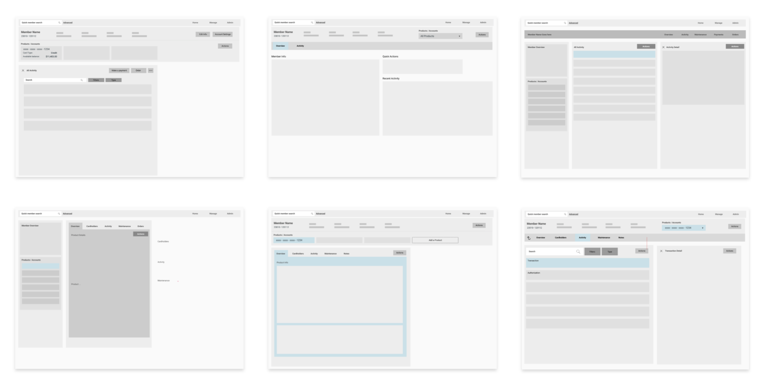
we came back together as a team to converge concepts and narrowed down the member-centric framework into a holistic platform that surfaces members on the account, product details, and transaction data.
We tested the concepts as early as possible and found that the concept aligned with the representatives’ workflow. Upon entering a member’s profile they had a better sense of the cardholders on the primary member’s account, were quickly able to view the callouts for account activity and information, and had the option to immediately take action on the account after confirming they have the right member.
However, even though the concept surfaced product data and transaction activity, representatives needed to see the transaction details per line item to assist with spservice requests, which differed between credit and debit. This data mapping was not something that the screenshots of the systems were going to help us understand.
I circled back to our subject matter experts to get a better understanding of how the data between credit and debit is sorted. This included weekly working sessions in our process to understand how the complexity of data would fit in our framework and get feedback on the evolving structure to fill in any gaps. I also followed up with users to understand how they use the data in their process

Meeting with the subject matter experts and following up with users, I learned:
There’s overlapping data that needs to be reflected for both credit and debit.
The difference between debit and credit transaction details comes from how they are processed: debit transactions draw directly from an account, while credit transactions come from a pre-authorization that allows the bank to take the funds.
The sequence of debit and credit transaction data that is important for users to see based on what’s most important in different scenarios, guiding which information to visually prioritize.
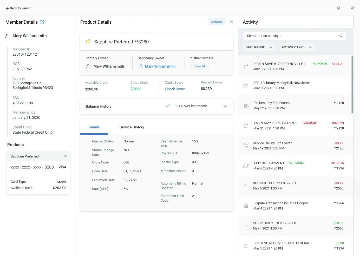
This allowed me to step back, reassess our framework, and iterate on it to include primary and secondary navigation, making complex information easier to navigate while showing only key member details at initial view.

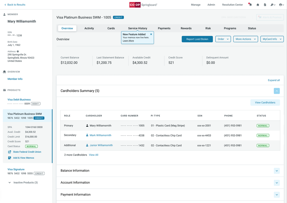
The member-centric module
The primary side navigation - displays the necessary member information on initial view with all products tied to the account to help the user understand each member’s portfolio of products and services and how they might interconnect.
The secondary top navigation - separates all the important sections related to the product.
Main actions - accessible from the overview screen including starting disputes for lost/stolen cards in Springboard and processing the case to completion in the Resolution Center.
A summary of cardholders - including the primary, secondary and additional cardholders on the account.
Account overview information - including prioritized sections.

VALIDATIONTesting the value propositions for a member-centric module and helping users seamlessly view their sorted credit and debit data.
We held usability testing sessions with 10-12 Credit Union Front-Line and Card Services Representatives per month across 21 Credit Unions to evaluate our redesign and uncover usability issues and opportunities.
The main takeaways from this research include:
Our validated hypotheses is that a holistic-back office platform as a member-centric module on the front end, improves efficiency and adds value to our users’ workflow.
There was a need to view both active and inactive products so that all of a member’s products could be tracked and referenced, regardless of their status.
The transaction details in the embedded view for debit could be broken out more to parse through it quicker.

THE FINAL DESIGN SOLUTIONDesigning a more efficient system for users to obtain cardholder information.
We conducted testing sessions with 48 participants to uncover usability issues and identify opportunities for the Phase 1 launch, where we focused on building all high-value features and a functional framework. Since Springboard is a large application, additional features were planned for Phase 2 to complete the system.
DELIVERY AND RESULTSOur design solution minimized the time it takes for Credit Union representatives to navigate between member products and find transaction data by 13%.
I worked with our developers to implement the design, and they delivered React UI components for Co-op’s engineers to use. Co-op Springboard launched as a web application that gives credit unions real-time access to cardholder account information as part of one system. It is now live helping over 1,000 global Credit Unions deliver improved member services and increase productivity due to the simplified account management experience.
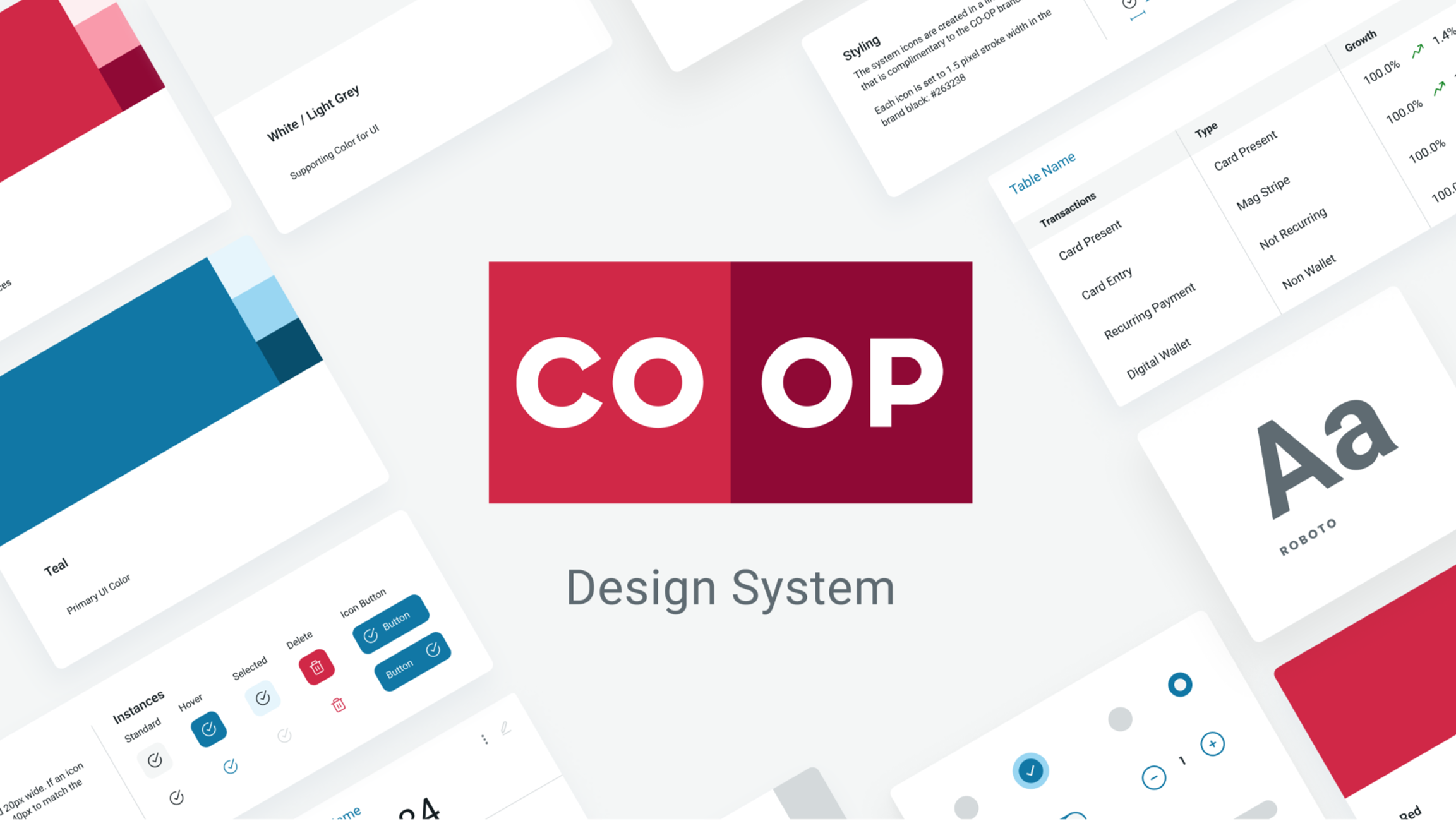
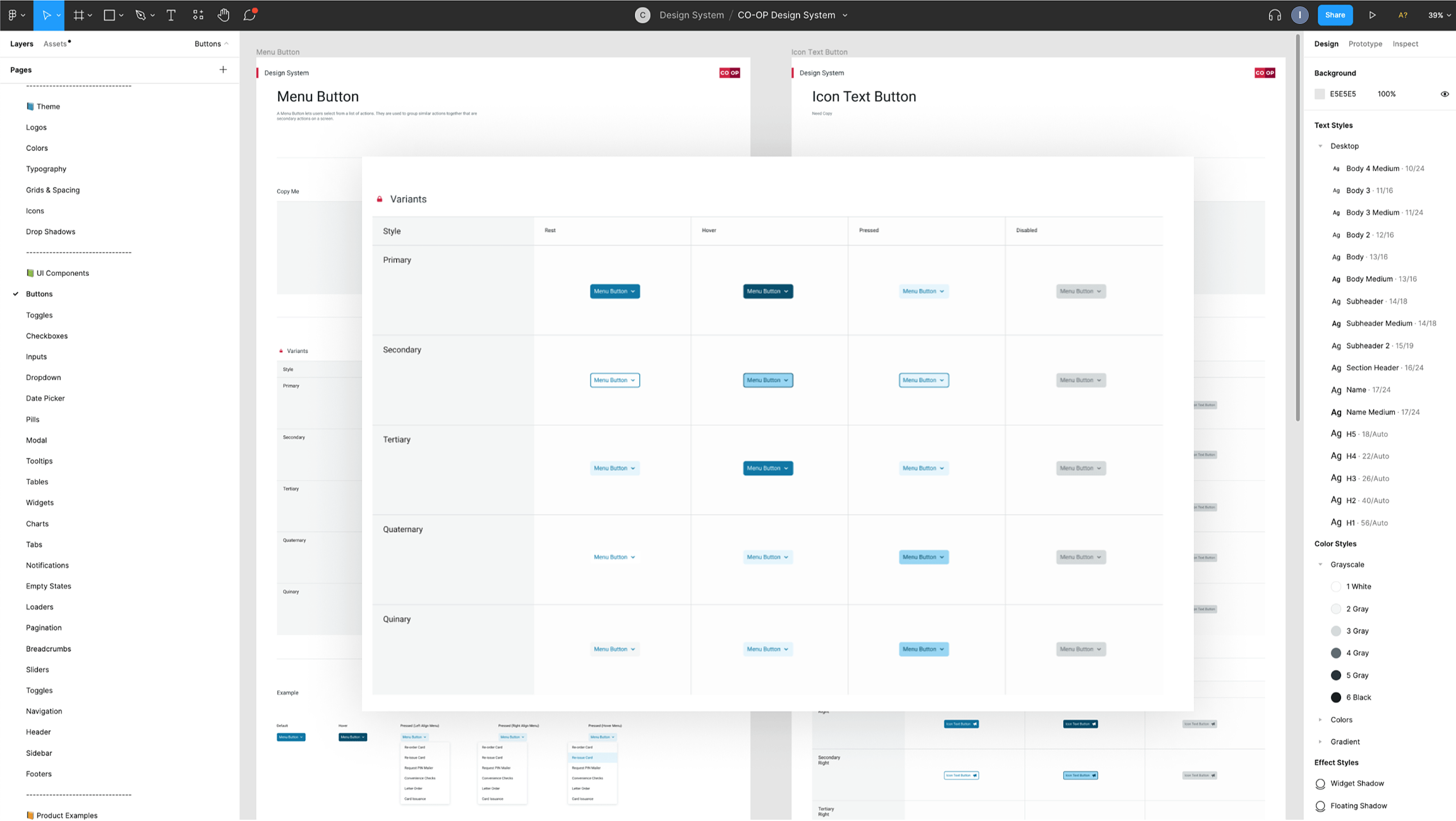
ADDITIONAL WORKDesign System
I I helped develop the design system in collaboration with the lead brand designer.